
This post is the last in a series of basic mixed media techniques. I wanted to do a post that pulls together all of the other posts in this series. I started with art journaling and have posts on stamping, stenciling, printmaking, collage and lettering which are all the ingredients you need to make a mixed media piece. (Of course you don't have to use all of them all of the time)
I figured I'd let you look over my shoulder as I create one based on a quote.
Using a quote to create in mixed media is a great way to start as it gives you a clear focus.
Step 1: Create a background
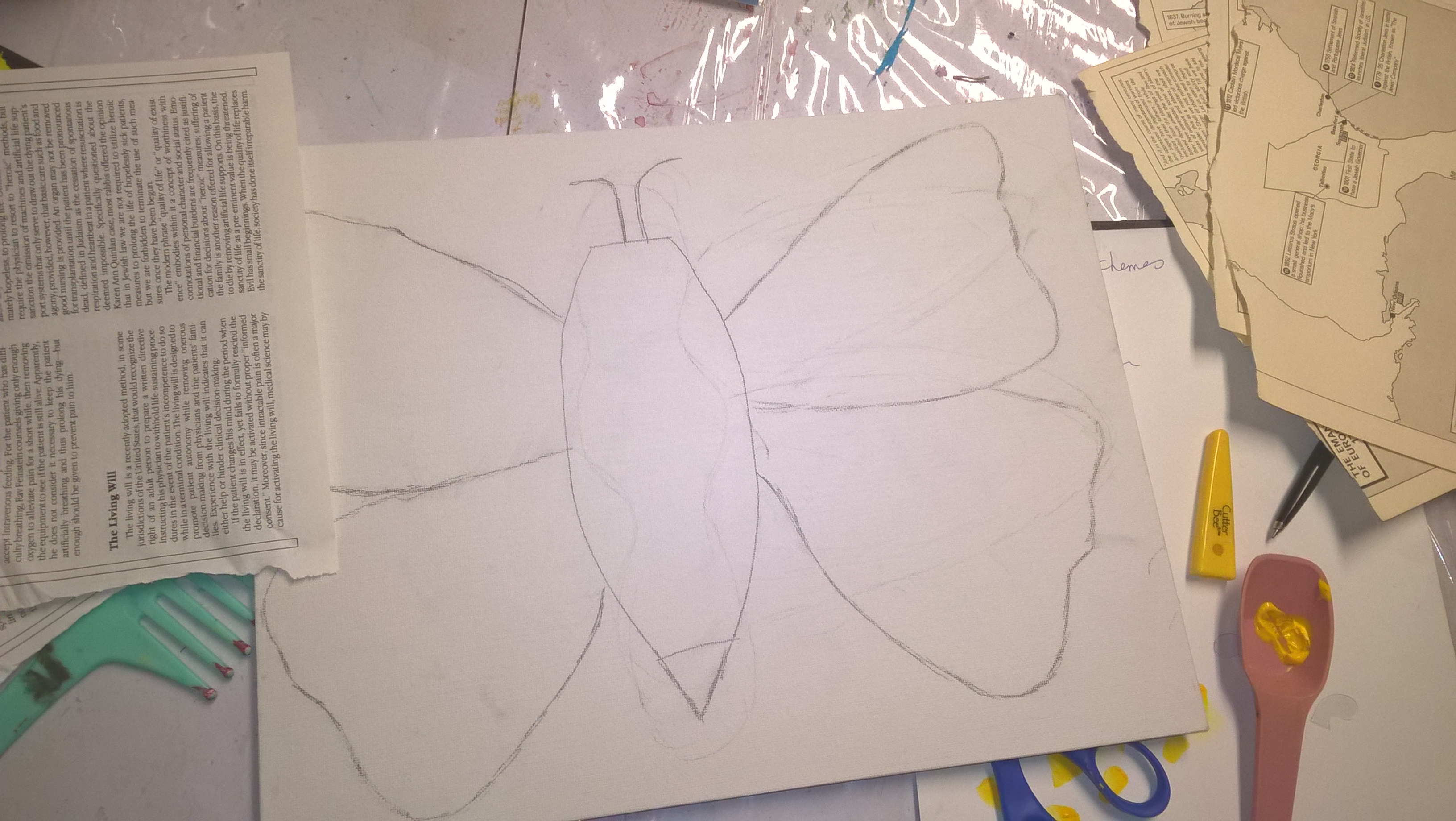
In looking for a background I found this old canvas that had been started by an old student and decided to use so it wouldn't get wasted.It was going to get covered up anyway.
I had recently tried out a peeled book paper, grungy looking background that I liked so I decided to use that idea. (Its actually not in my post on making different backgrounds)
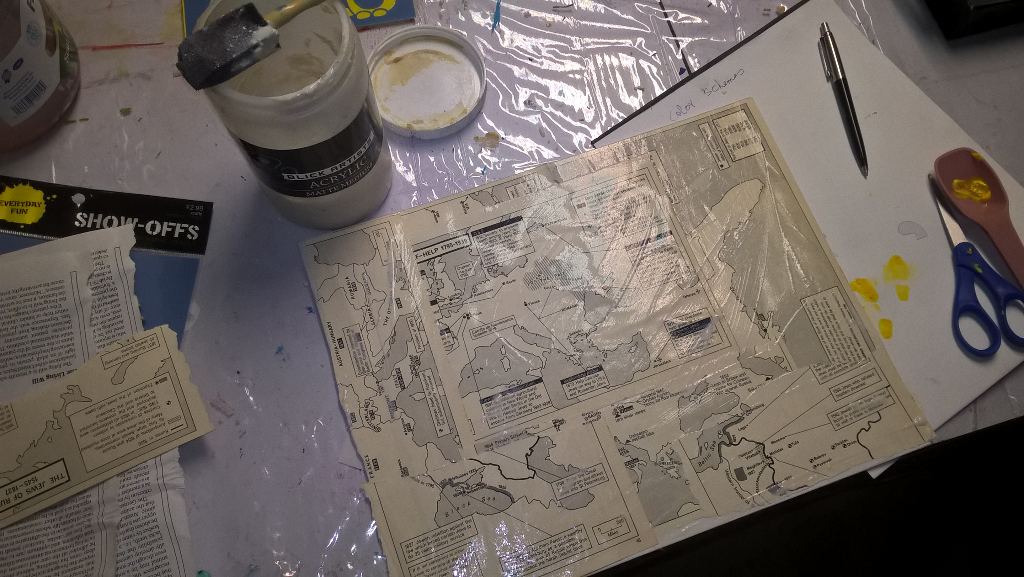
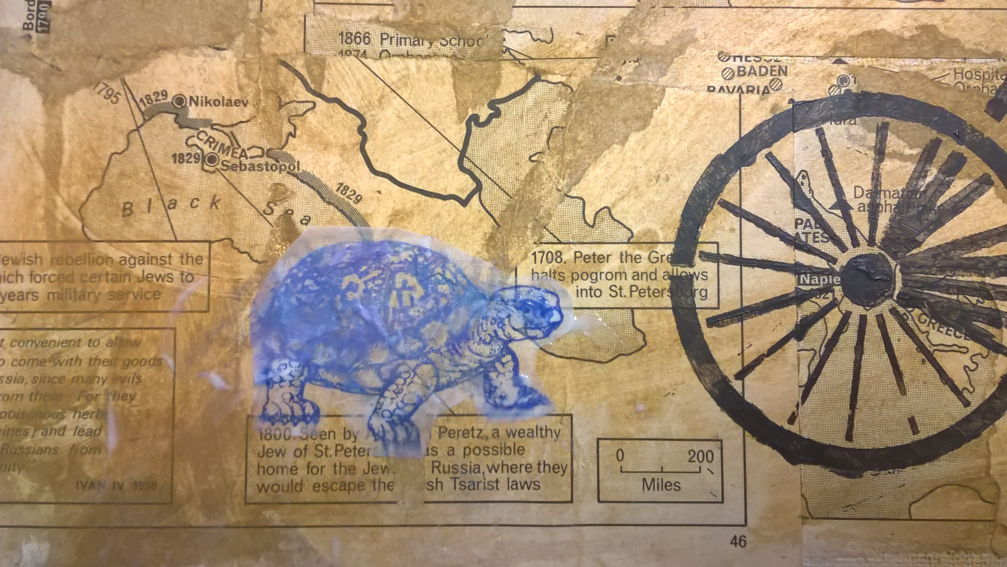
The techniqe calls for old book pages and I found old pages that were all text but, didn't look so old and some map pages that had an older look.
I decided to go with the old map looking pages since the antique..y look appealed to me. I adhered a few pages, overlapping them using matte medium as my adhesive.
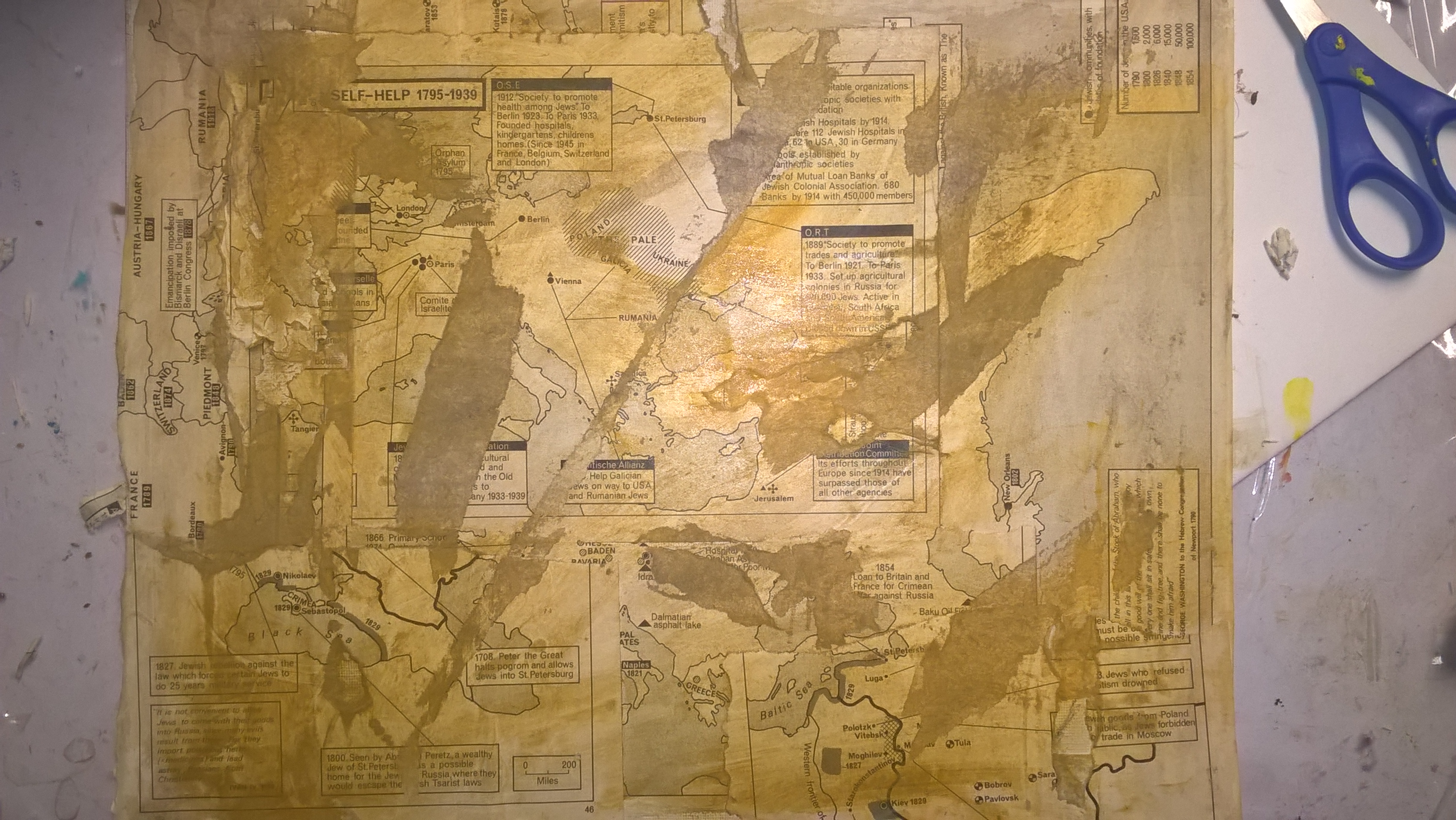
I then took tape (I only had pretty tape but, masking tape works best) lay it over the background after it was dried and then rip it off starting to give it the torn, peeled look.
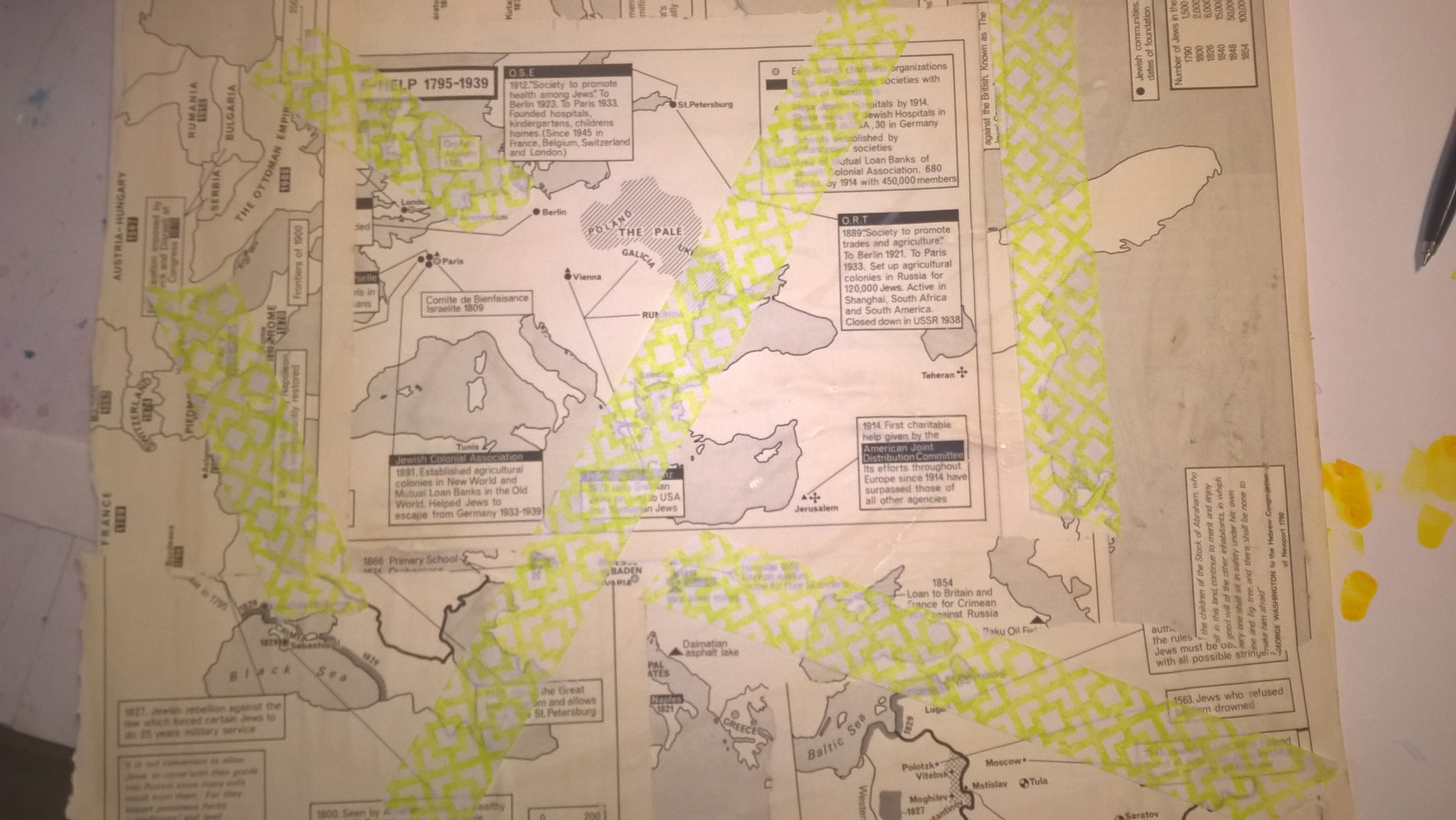
After I had a number of rips that seemed OK to me, I scratched off more pieces around the background with my nail.
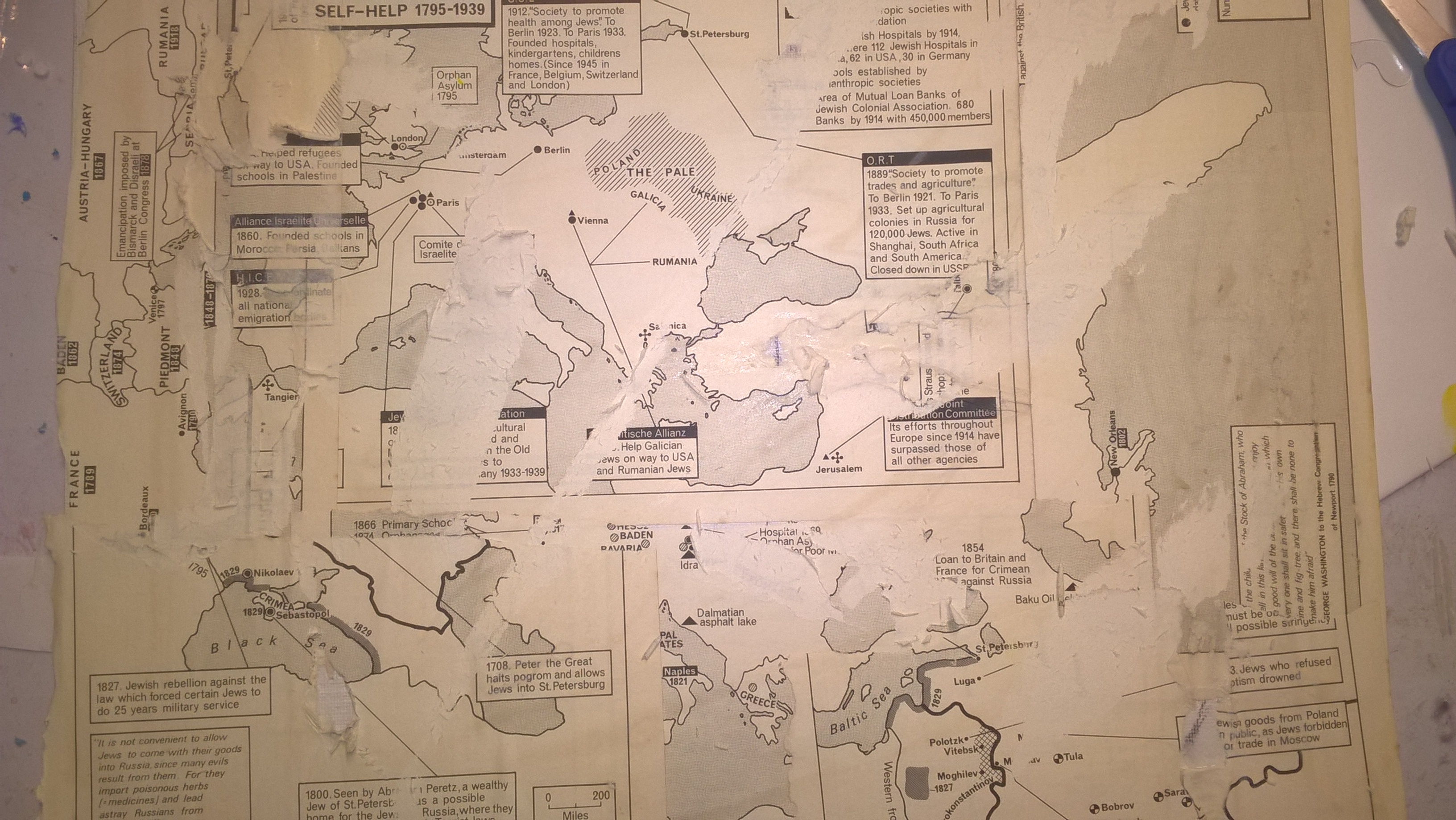
I then chose a a raw umber color of acrylic paint and mixed it with water to paint over in a wash. I chose the brownish color to go with the antique look of the maps.
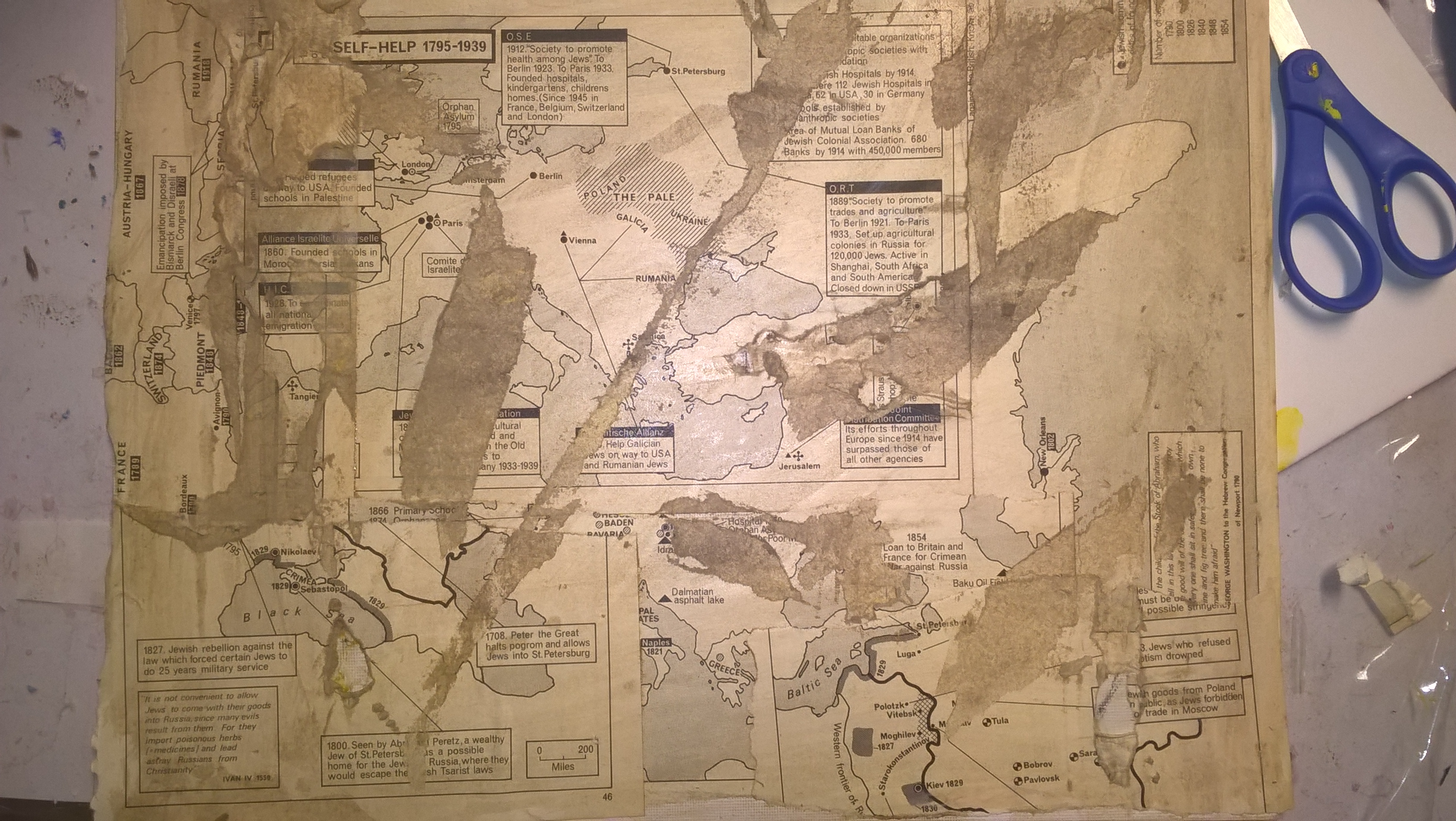
I then took another undiluted matching color of yellow ochre that I thought would look good with the brown and rubbed it into different places on the background.
Step 2: Pick a quote
If you want to choose a quote before you do your background that is fine but, I chose to do the background first since that was the one thing I knew I wanted to start with. I had a number of quotes already saved so but, you can always google quotes based around a theme.
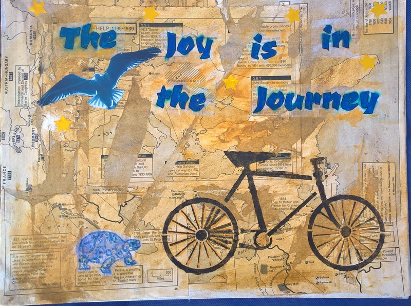
Since my background has some sort of theme I chose a quote from my saved quotes that would go with it and chose "The Joy is in the Journey".
Step 3: Add a main element
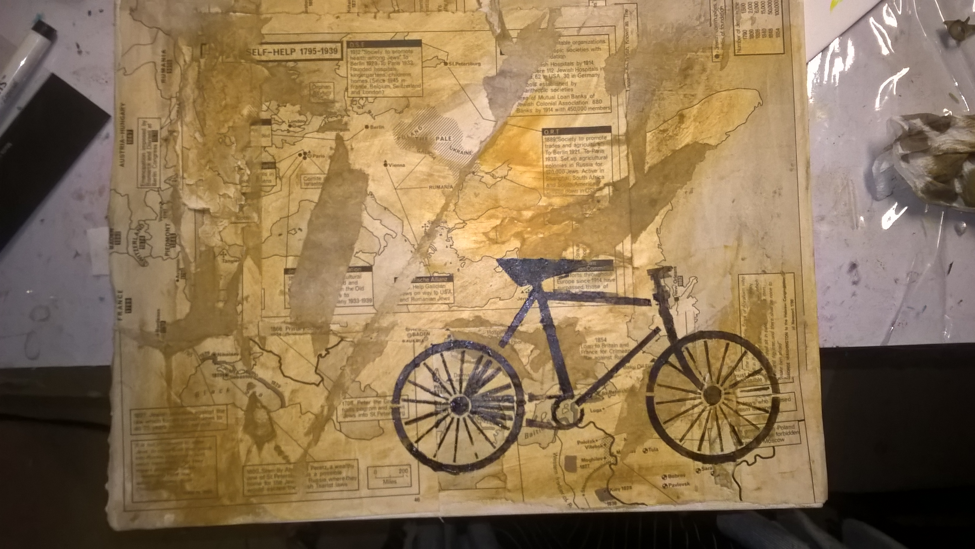
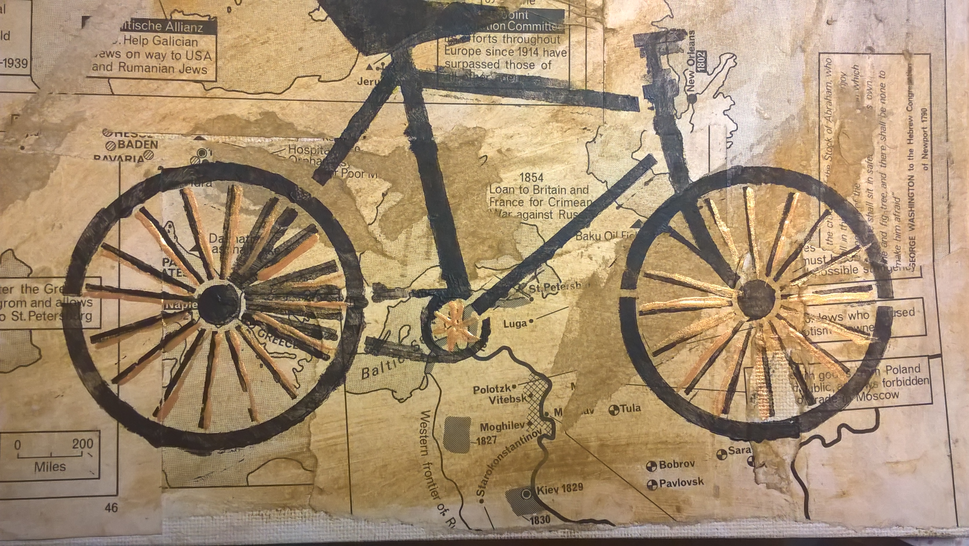
I needed something that would be the focus of the piece and went to find an image from my collage stash but, then my eye fell on this brand new, unused bicycle stencil and thought... Perfect!
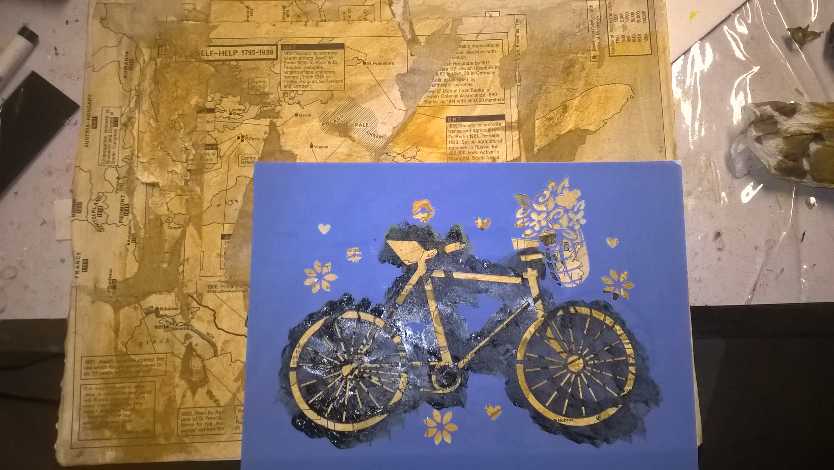
I stenciled it in black to make sure it would really stand out.
Step 4: Add the quote
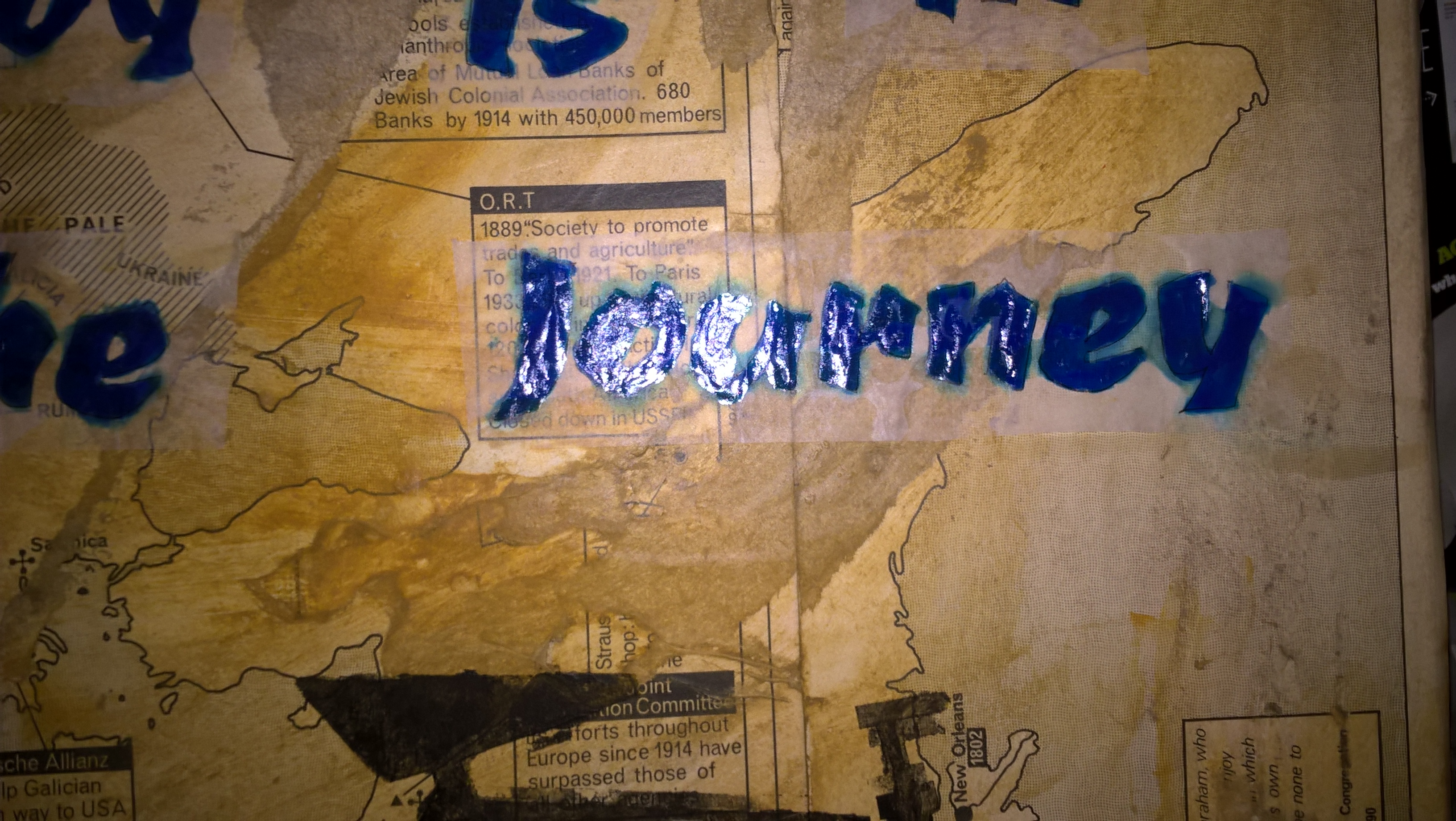
Of course, I could have waited until I finished the whole piece before doing the lettering but, I needed to know that there would be space for the words. So now I had to decide what type of lettering I wanted. I ended up picking a font from computer.
I printed it in 2 different fonts with my quote in the sizes I thought I would need.
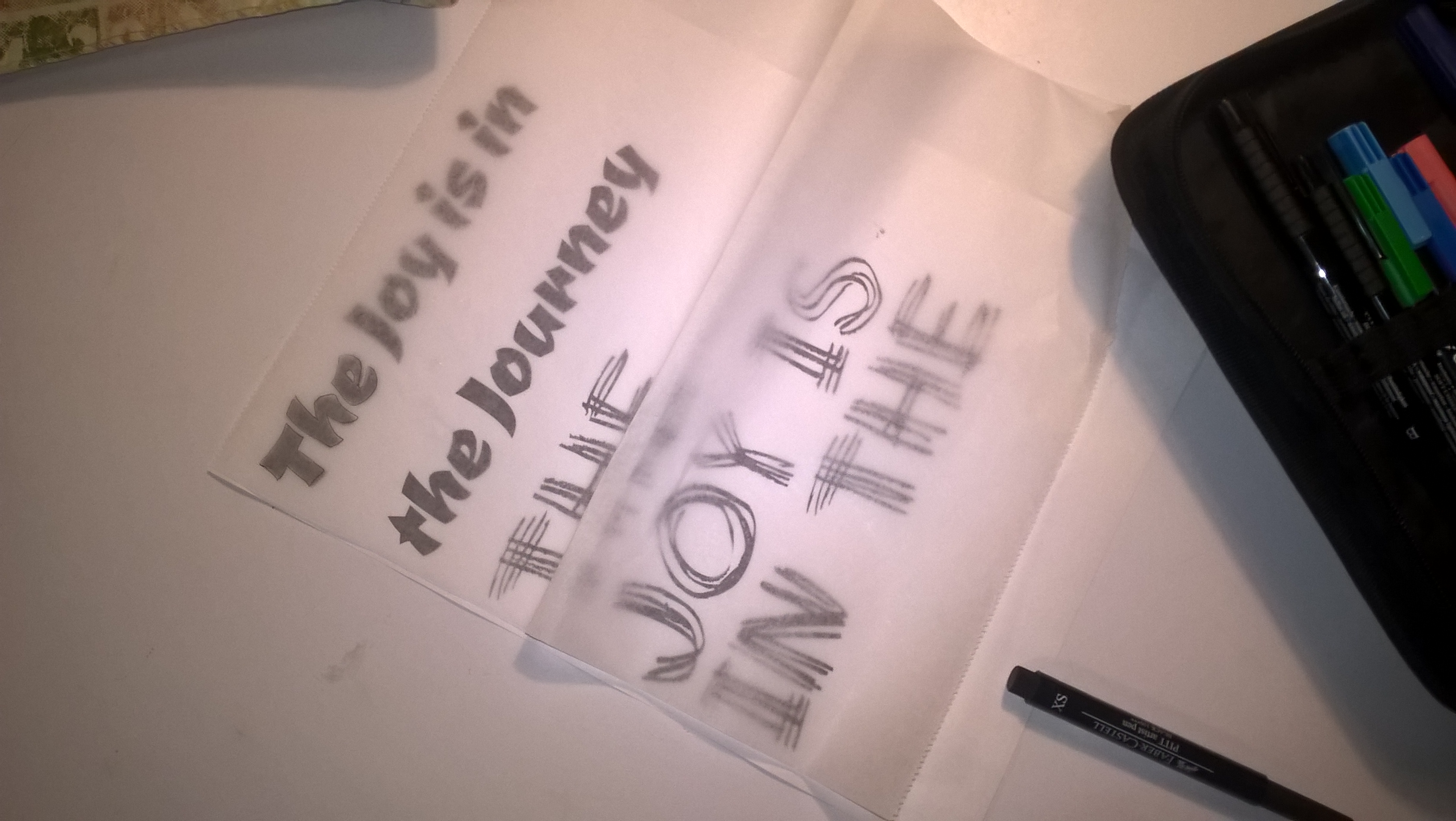
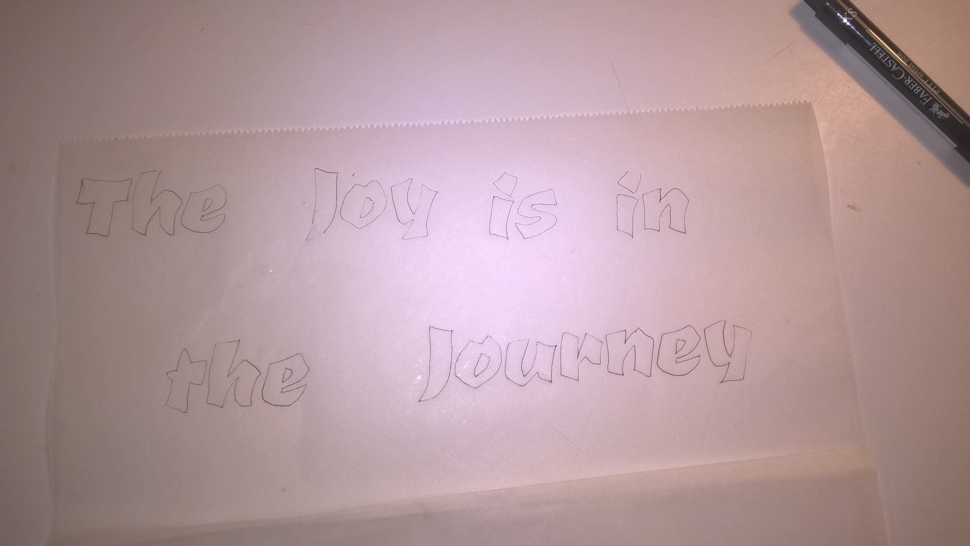
I chose one and then traced over the quote onto a piece of deli paper. Tracing paper works just as well for this technique.
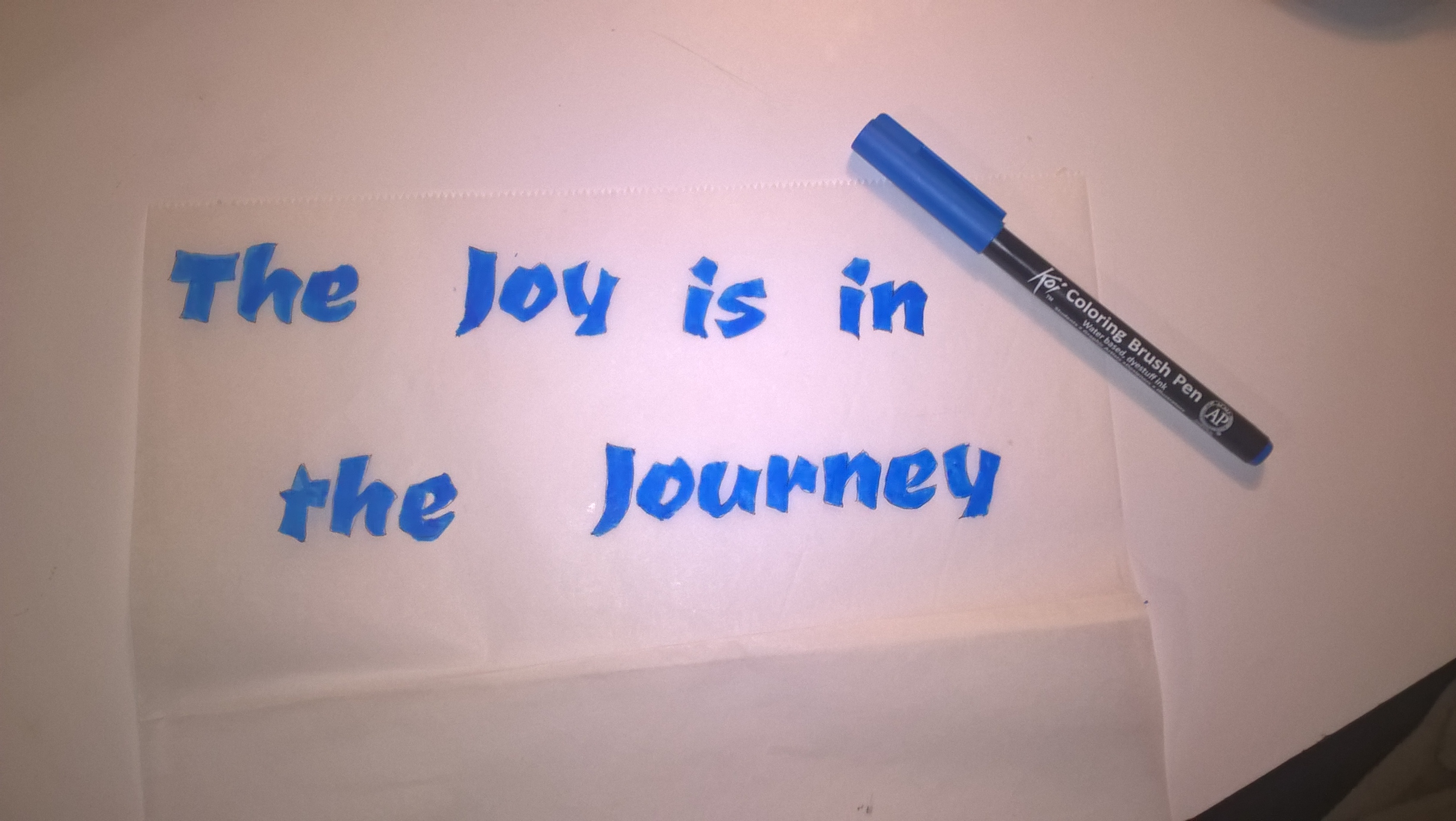
I chose a blue marker to color in the words. (I did not realize that it wasn't waterproof)
I cut out the words and arranged them on my piece.
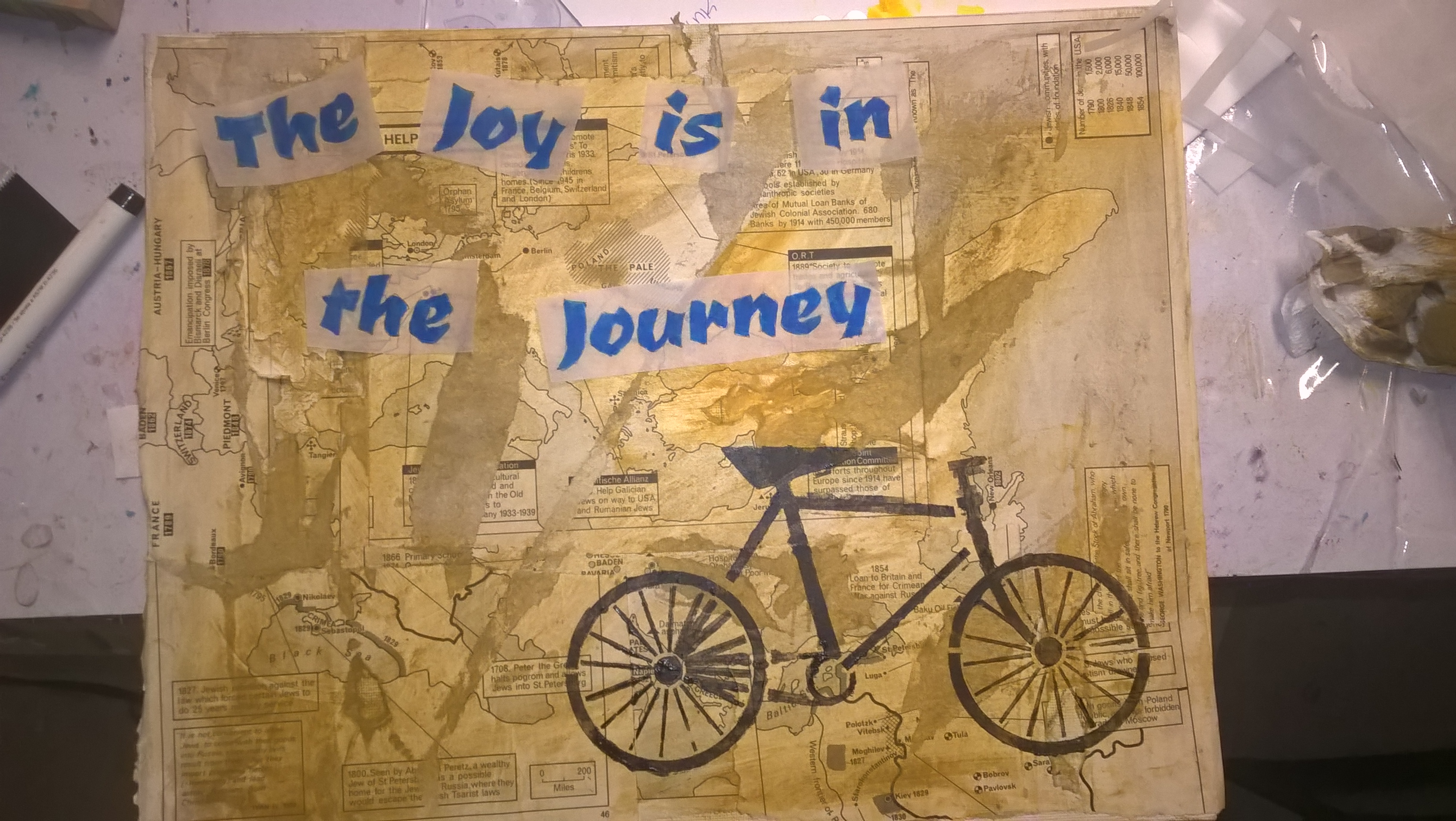
Then glued them down with the matte medium. (it dries clear)
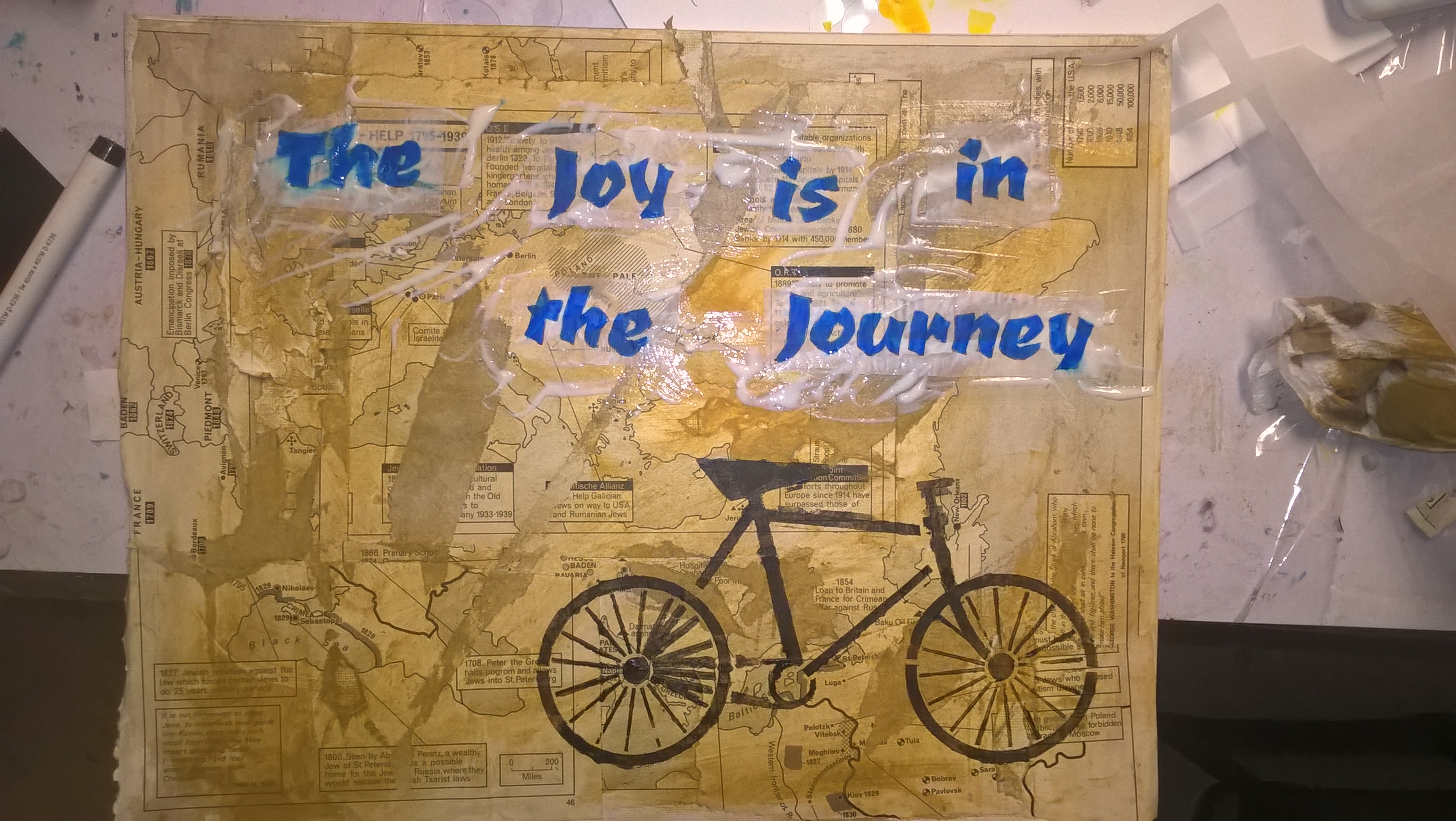
As you can see, I had not realized that the marker wasn't waterproof and the letters smudged.
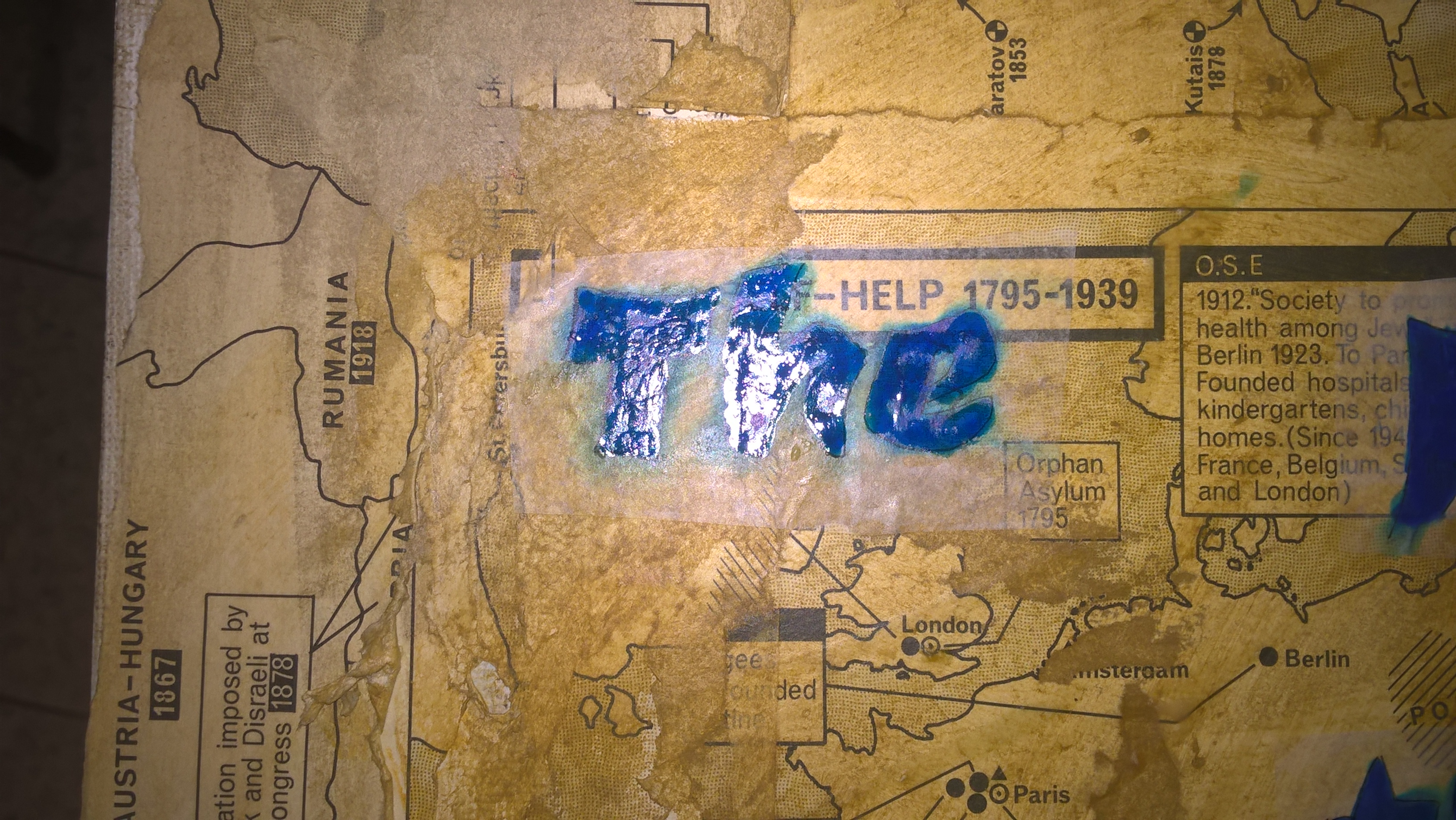
As a result I saw I wasn't able to put enough medium all around to get the deli paper to melt into the background so you wouldn't see it.
Step 5: Add other elements like stamping or collage pieces
I wanted something else to add to the left side of the bike so I started looking through collage pieces and stamps to see what I had that would fit into the theme. I found the turtle stamp & I thought it added to the idea of journey. (Remember the tortoise and the hare?)
I tried one set of colors first and stamped it on deli paper but, didn't like how it went with the color scheme so I ended up doing the turtle in blue to match my letters.
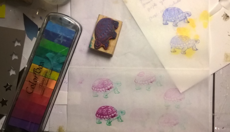
The reason I did it on deli paper again was because firstly if I made a mistake I could do it over (which I did) and I was scared it wouldn't stamp on the background. This way I'm able to just add it to the background with some medium.
I then found a bird in my collection of magazine images I saved and added some gold stars with my craft star punch.
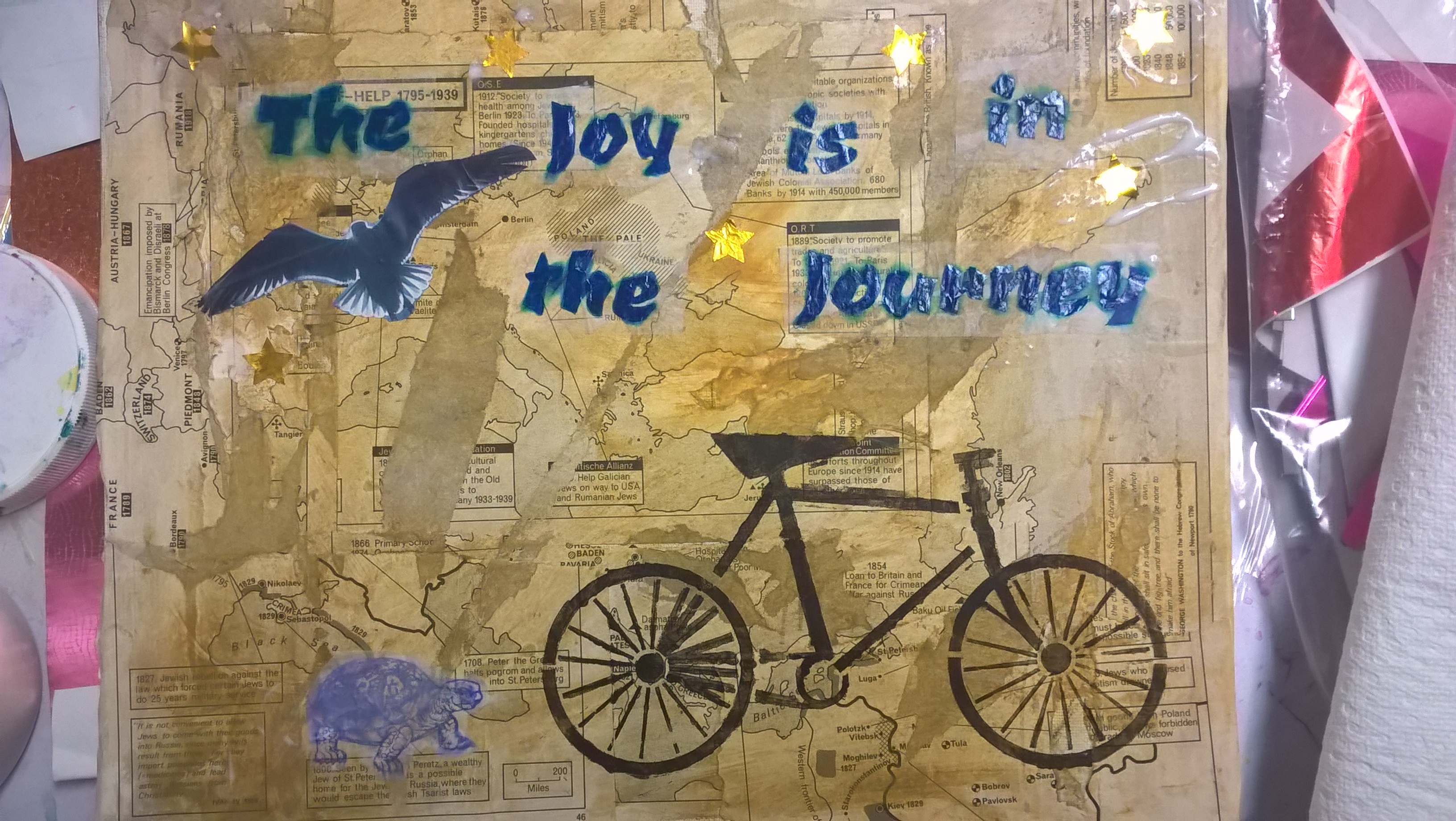
I felt that the gold needed to be balanced so I also added some gold with gold paint to the bike spokes.
I then outlined the letters with a black sharpie to sharpen them up, added some ocher paint around the letters where you could still see the white deli paper and added some definition to the turtle. I then added some clear gloss medium to the top to seal it all and give it a shine. I guess adding the gold spokes can be considered doodling. (For the doodling aspect 🙂
So there you go...a step by step process that includes almost all of the mixed media techniques that I wrote about in this section.
It's a good idea to start saving pictures you like from magazines and other places and to also start collecting quotes so you don't have to start googling ones you like.
So how hard was that? Can you see yourself doing something like that?
I really like this technique and can’t wait to try it out! I especially like how you used the tape to rip off some of the map pieces! Cool way to add to that old grungy look!
Thank you Casey…I liked that idea as well as soon as I saw it in a book and tired it out as soon as I was able to